
How to Read Stock Charts and Graphs Like a Pro: Simple Techniques for Beginners
When most beginners open a stock market chart for the first time, confusion is natural.
Prices move up and down, candlestick shapes look complicated, and graphs feel overwhelming. Based on real market experience, the problem is not that stock charts are difficult — the real issue is that they are often explained in a technical way that beginners cannot relate to.
In reality, stock market charts are nothing more than a visual record of how price behaves over time. Every line, candle, and bar reflects real buying and selling decisions made by traders and investors in the market.
Once you learn what these price movements actually mean, charts stop feeling confusing and start making sense. This guide is designed to help beginners learn how to read stock market charts and graphs step by step, using practical explanations, real-world insights, and clear language — without unnecessary jargon or complex theories.
What Are Stock Market Charts and Graphs?
Stock market charts and graphs are tools that show how a stock’s price changes over time. From practical experience, beginners often think charts are complicated, but in reality, they are designed to make price movement easier to understand, not harder.
Every stock market chart answers three basic and important questions:
- What is the price right now and in the past?
- When did the price move up or down?
- How strong was the buying or selling behind that move?
A stock chart usually shows detailed price action, such as opening price, closing price, highs, and lows. This level of detail helps traders understand what happened during a specific time period.
A stock market graph, on the other hand, gives a quick visual view of the trend, helping investors see whether the price is moving up, down, or sideways.
Both charts and graphs are widely used by traders and long-term investors to analyze price behavior, manage risk, and make more informed decisions, instead of relying on guesswork or emotions.
Why Learning How to Read Stock Market Charts and Graphs Matters
From real trading and investing experience, many beginners enter the stock market based on news headlines, tips from others, or emotions like fear and greed. While these factors feel convincing, they often lead to poor timing and unnecessary losses.
Stock market charts bring clarity and structure to decision-making. Instead of guessing, charts allow you to:
- See the real market trend rather than relying on opinions
- Understand price direction and momentum
- Avoid emotional buying and panic selling
Charts show what the market is actually doing, not what people are saying. This makes them a more reliable tool for both traders and long-term investors.
Whether your goal is short-term trading or long-term investing, learning how to read stock market charts and graphs helps you enter positions at smarter prices, exit with better timing, and manage risk more effectively.
Types of Stock Market Charts You Must Know
There are different types of stock market charts, and each one serves a specific purpose. From practical experience, beginners should first understand basic chart types instead of jumping into complex tools. Mastering these charts builds a strong foundation.
Line Charts – The Simplest Chart for Beginners
A line chart connects the closing prices of a stock using a single continuous line. It gives a clean and clear view of how price moves over time.
Best for:
- Long-term price analysis
- Complete beginners
- Understanding the overall market direction
Limitation:
A line chart does not show detailed price action like highs, lows, or opening prices. Because of this, it is less useful for short-term trading decisions.
Bar Charts – More Information About Price
Bar charts provide more price details than line charts. Each bar shows:
- Opening price
- Closing price
- High price
- Low price
These charts help traders understand how price behaved during a specific time period. However, from experience, bar charts can feel slightly confusing for beginners at first because they contain more information.
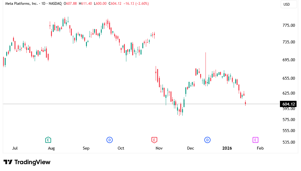
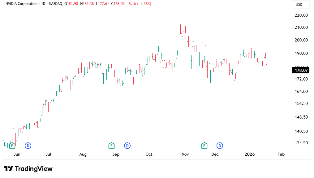
Candlestick Charts – The Most Popular Chart Type
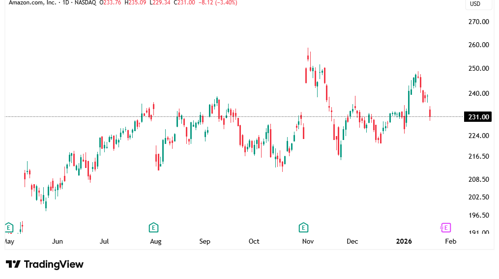
Candlestick charts are the most widely used charts in the stock market. Each candlestick shows:
- Open price
- Close price
- High price
- Low price
Candlesticks visually represent buyer and seller strength, making market behavior easier to understand. Based on real learning experience, once beginners understand candlestick charts, their ability to read stock market charts improves very quickly.
How to Read Candlestick Charts Step-by-Step
Candlestick charts may look confusing at first, but from real learning and trading experience, they are one of the easiest and most powerful ways to understand market behavior once you know the basics.
A single candlestick has two main parts:
- Body – shows the difference between the opening price and the closing price
- Wicks (also called shadows) – show how far the price moved above or below the body during that time
These two parts together tell a clear story about buyer and seller strength.
Green (Bullish) Candlestick
A green or bullish candle means the price closed higher than it opened.
This shows that buyers were in control during that period.
The stronger and longer the candle body, the stronger the buying pressure.
Red (Bearish) Candlestick
A red or bearish candle means the price closed lower than it opened.
This shows that sellers were stronger than buyers.
Long red candles indicate strong selling pressure.
What Candle Size Really Means
- Long candles show strong momentum and clear market direction
- Small candles show uncertainty, low strength, or a balance between buyers and sellers
From experience, beginners improve much faster when they stop memorizing candle names and instead focus on what the candle is saying about market strength.
Understanding Stock Price Trends (The Most Important Skill)
Reading stock price trends is the core skill of chart analysis. From real market experience, most successful traders and investors focus on the trend first — because everything else works better when you understand market direction. Learn how traders identify strong stock trends and momentum before entering trades.
A trend simply shows where the price is moving over time.
Uptrend
An uptrend happens when the price consistently makes:
- Higher highs
- Higher lows
This means buyers are in control, and demand is stronger than supply. In an uptrend, the market generally rewards buying opportunities rather than selling.
Downtrend
A downtrend forms when the price creates:
- Lower highs
- Lower lows
This shows that sellers are dominating the market. From experience, buying blindly in a downtrend often leads to losses unless there is a clear reversal signal.
Sideways Market
A sideways market occurs when:
- The price moves within a range
- There is no clear upward or downward direction
In such conditions, the market is undecided, and price often moves between support and resistance levels.
Why Trading With the Trend Matters
Based on real trading experience, beginners lose money by trading against the trend. The market does not reward predictions — it rewards patience and alignment with direction.
The market favors those who follow the trend, not those who try to fight it.
Support and Resistance – Key Levels Every Trader Watches
Support and resistance are two of the most trusted and widely used concepts in stock market chart analysis. From real trading experience, these levels help traders and investors understand where price is likely to pause, reverse, or react.
Support Level
Support is a price level where buyers usually step in and prevent the price from falling further.
At this level, demand becomes stronger than selling pressure.
In simple terms, support acts like a floor that holds the price up.
Resistance Level
Resistance is a price level where sellers usually enter and prevent the price from rising higher.
At this level, selling pressure increases and stops further upward movement.
Resistance acts like a ceiling that limits price growth.
How Price Reacts at These Levels
From experience, price often:
- Bounces upward from support
- Gets rejected downward from resistance
These reactions happen because many traders and institutions watch the same levels, making them powerful and reliable.
Why Support and Resistance Matter
Support and resistance levels help traders:
- Plan better entry points
- Set logical stop-loss levels
- Avoid buying at highs or selling at lows
Understanding these key levels adds structure and confidence to chart-based decisions.
Volume in Stock Market Charts – The Hidden Confirmation Tool
Volume shows how many shares are being traded during a specific time period. While many beginners focus only on price, real market experience shows that volume is what confirms whether a price move is strong or weak.
What Volume Really Tells You
- High volume means strong interest from traders and investors
- Low volume means weak participation and low confidence in the move
A price move with high volume usually indicates real strength, while a move with low volume can be misleading.
Why Price Alone Is Not Enough
From practical trading experience, price movement without volume is unreliable. A stock may move up or down, but without strong volume, that move may not last.
When price and volume move together, the signal becomes much more trustworthy.
How Beginners Should Use Volume
Beginners should use volume to:
- Confirm breakouts
- Validate trends
- Avoid false price moves
Volume does not predict the market, but it helps you trust what the price is doing.
Basic Chart Indicators Beginners Should Learn First
Indicators are tools that help you understand charts better, but they should support your analysis, not confuse you. From practical experience, beginners often make the mistake of adding too many indicators, which can clutter the chart and make decision-making harder.
Moving Averages
One of the simplest and most useful indicators is the moving average.
- Shows the average price over a specific period
- Helps identify the overall trend direction
- Smooths out short-term price fluctuations, making trends clearer
Pro Tip from Experience:
Don’t overload your chart with multiple indicators. Clean charts with one or two key indicators work best for beginners.
Common Stock Chart Patterns (Beginner-Friendly)
Chart patterns are visual shapes on the chart that can indicate possible price movements. Beginners should start by recognizing a few basic patterns:
- Double Top & Double Bottom – show potential trend reversals
- Head and Shoulders – signals a possible trend change
- Breakouts from Ranges – indicate strong moves after consolidation
Important Truth:
Patterns increase the probability of a move, but they do not guarantee it. Always combine patterns with trend analysis, volume, and other indicators for better accuracy.
How to Read Stock Market Graphs for Long-Term Investing
For long-term investing, the key is looking at the big picture rather than reacting to daily price movements. Stock market graphs help you identify long-term trends, avoid unnecessary mistakes, and make more informed decisions.
To read graphs effectively for long-term investing, focus on these points:
- Use weekly or monthly charts: These charts show overall trends and filter out short-term noise, making it easier to see where the market is truly heading.
- Identify bigger trends: Look for consistent upward or downward patterns over months or years to guide your buying and selling decisions.
- Ignore short-term fluctuations: Daily swings are normal and do not indicate the true direction of the market. Avoid making decisions based on small movements.
By following these steps, investors can avoid buying at market peaks, stay calm during minor corrections, and make decisions based on long-term trends rather than temporary market swings. Properly reading stock market graphs gives you confidence and structure in long-term investing.
Mistakes Beginners Make When Reading Stock Charts
From real trading experience, beginners often make mistakes that can lead to losses or confusion. Some common errors include:
- Overtrading – entering too many trades without clear strategy
- Ignoring trend direction – trading against the market often results in losses
- Using too many indicators – cluttered charts make decisions harder
- Trading with emotions – fear and greed can override analysis
Pro Tip:
Learning to read charts slowly and consistently is far more effective than rushing. Build your skills step by step. Discover why account size can impact your trading decisions and risk management.
Best Free Tools to Practice Reading Stock Market Charts
Before risking real money, beginners should focus on practical learning. From experience, the fastest way to improve chart-reading skills is through consistent practice.
- Use free charting platforms – Tools like TradingView or Investing.com let you explore real charts and trends without financial risk.
- Practice with demo or paper trading accounts – Platforms like MetaTrader 4/5 or broker demo accounts let you simulate trades and observe how price behaves.
- Focus on learning, not early profits – Understanding charts is more important than making quick gains.
Key Insight:
Regular practice builds confidence much faster than theory alone, helping beginners read charts like real traders. Compare forex and stock trading to understand which market suits your style.
Use free online tools to track and understand your personal data for smarter lifestyle decisions.
Final Thoughts – Stock Charts Are a Skill, Not a Talent
Reading stock market charts is not something you are born with. It is a skill that develops over time through learning and consistent practice. From experience, beginners who start simple and focus on fundamentals improve much faster than those who try to master everything at once.
How to Build Your Chart-Reading Skill
- Learn one chart type at a time – start with candlestick or line charts
- Follow the trend – always trade or invest in the direction of the market
- Avoid over-analysis – too many indicators or patterns can create confusion
With patience and regular practice, charts will stop feeling confusing, and you will start reading price action naturally.
Remember: Skill in chart reading comes from experience, observation, and consistent learning, not shortcuts or luck.
Disclaimer: This article is for educational and informational purposes only. It does not provide financial or investment advice. Stock market trading involves risk, and past performance does not guarantee future results.
FAQs
Is reading stock charts hard for beginners?
No, It only feels hard because of complex explanations.
Which chart is best for beginners?
Candlestick charts with trend lines.
Can stock charts predict the market exactly?
No, They only improve probability.
How long does it take to learn chart reading?
Basic understanding can be developed in a few weeks with practice.Should beginners use many indicators?
No, Start with one or two key indicators and focus on trends and price action.


2 thoughts on “How to Read Stock Market Charts and Graphs: Learn the Secrets Traders Use to Spot Trends”
Pingback: Is an Adaptive Moving Average Machine the Secret to Smarter Trading Decisions?
Pingback: Stock Market Pessimist: Why Some Investors Always Expect a Crash